Explaining the pricing black box


The need to explain
In the never-ending pursuit of even better and more accurate price models in recent years we turn our eyes more towards more complex modelling tools. To say that the interpretation of such models can be challenging due to the sheer scale of number of their parameters, is to say nothing. As insurance pricing experts we know there must be balance between the accuracy and transparency of the price model used commercially. The customers have to be treated fairly and there are demands of the regulators which have to be met (see: The great compromise: Balancing Pricing Transparency and Accuracy). New regulations are on the way, like the EU AI Act proposed in April 2021 and expected to reach an agreement by the end of the 2023. We understand we need new tools.
The tools I mention will help us – the analysts – cut through the jungle of intricacy. It’s not only about the regulation! We cannot simply say “the model is fitted this way” and consider the job done. We need to understand what is happening inside the model or otherwise any attempt to improve it is a wild guess.
In the remaining part of this article, you will learn:
• How to understand the term black box
• The visual methods of explainable AI
• The approach to explainable AI through local or global approximation with another model
The black box
The term appears very frequently with almost all non-technical articles on machine learning. In 2022/2023 we observe the explosion in popularity of one such black box – the large language model wrapped in a chatbot. It might be that the basic principles of its inner workings gradually seep through to the public and many people can say they understand on basic, most general level what it does, how does it do it or why it gives such and such answers. However, we don’t fully understand it. The model’s architecture is not derived from any physical or biological system. It just works this way and does not work some other ways. We don’t know why. The model (GPT-4) includes around a trillion of parameters. It’s so many we can’t comprehend what is happening there. The creator of ChatGPT said he’s worried they might’ve already done something bad. The concern stems from lack of full comprehension.
But language is something else, we do pricing. Our models can be very complex, but most probably won’t even get close to the example above. In this context the black box from the title refers mainly to estimators such as ensembles of decision trees or neural networks (see also: Marching into the future: Exploring the Power of Machine Learning in Insurance Pricing). However, if we take a step back, we can see that less complex GLM/GAMs can be built in a complex procedure of automated modelling. In case like this the challenge is not in explaining the predictions but in understanding the whys of its final design. The binning strategy used, mapping created, transformation chosen, and interaction term included – it all may raise eyebrows and make us ask nontrivial questions like “why this way?”. It’s the choices that counter our intuition that make the black box idea extend also to the more familiar, and better understood class of estimators (see also: Smarter, Not Harder: How actuaries automate work on GLMs using AI).

The black toolbox
Let’s gather some tools and organise them in a box (I’ll choose the black one). The tools to better understand the hidden inner workings of the black box models.

The visualisations
The picture is worth a thousand words. A collection of numbers might be informative, but if properly organised, they can tell a story and provide deeper understanding of the topic. That is why the first class of tools are charts and plots.
Ceteris paribus
You may also know it by names like “single profile”, “what-if analysis” or a “what-if curve”, we’ll abbreviate it as “CP”. The name gives us a hint as to what it does. “Ceteris Paribus” comes from Latin and means “all other things being equal”. We assume a single observation, a complete datapoint and choose a variable with which we want to analyse the model. Then we plot the prediction values for the specified datapoint, but in the chosen variable we use a “full” array of its possible values. “Full” in the sense that we take all categories available and a sufficiently large array of values for a continuous feature.
Note that in regression models we analyse the prediction value, while in classification models we take the probability and not the expected flag value.
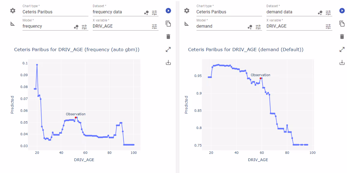
It is used to answer questions like “what would have happened to the price if the client had one year fewer of claim-free driving history?”. We use it in situations where the predicted price changes for a client and we need to understand the impact of the chosen variable on the prediction value.
The method belongs to the class of local explainers. It means it focuses on the model dynamics around a specified point. The counterpart of the class are global explainers, which look at the model as a whole.
Partial Dependency Plot
In short PDP. It is an example of marginal effect plots and can be defined as an average prediction value. It corresponds to the Ceteris Paribus method in the sense that the plot value is obtained as the average over the whole dataset of single CP lines. We choose the variable we want to analyse and then for each record from the dataset we substitute value of the variable and get the prediction. Next, we aggregate (in this case we take mean value) the results and plot the average over the analysed variable.
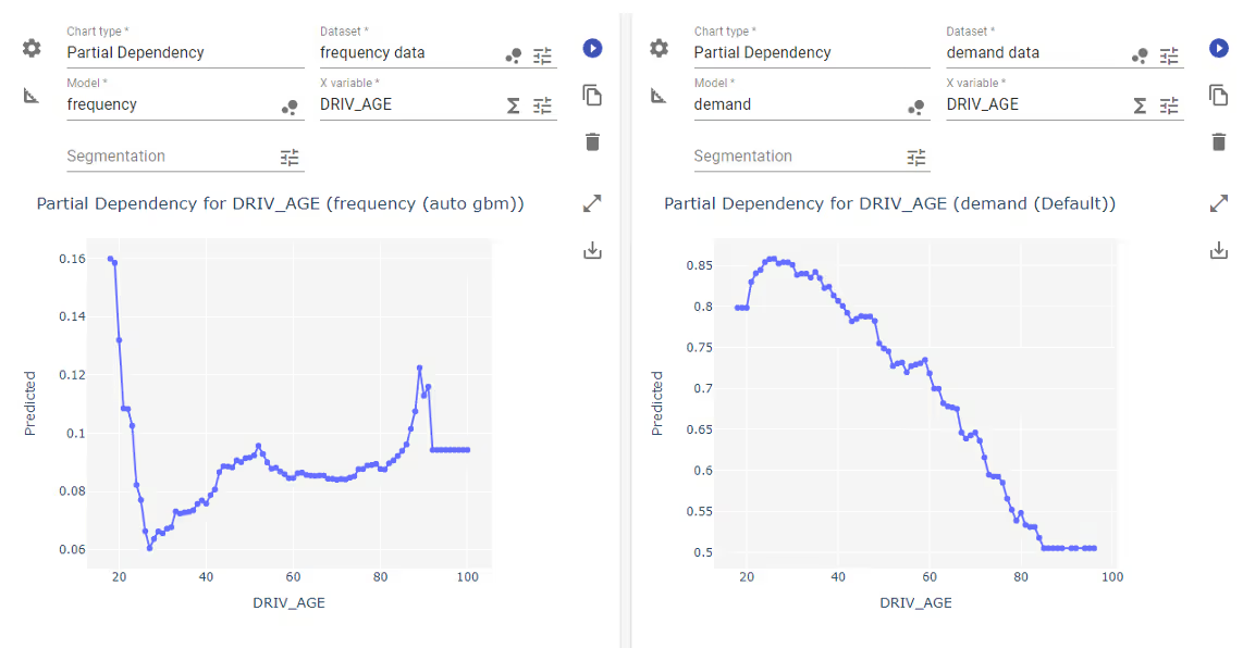
PDP is of course a global explainer as it analyses the average output of the model on the whole dataset. It’s usually used to identify nonlinearities in the model and assess their impact on the prediction value. This kind of relationships are immediately visible. The identified nonlinearities might drive the change in customer segmentation.
Another use for this plot is to identify outliers and changes in the quality of data. For instance, when we spot a sudden spike in mean prediction values this might be related to an outlier we should take care of.
Individual Conditional Expectation
Somewhere between CP for a single point and marginal PDP for the whole dataset lies a chart called Individual Conditional Expectation (or ICE). It’s considered to be a global method since it aims to analyse the full model. The ICE in a way unpacks PDP into a series of individual CP lines, all stacked on the same chart.
There might be a lot to look at and frankly it might be too much in some cases. However, when the relationships are consistent the chart gives us a glimpse into the interactions between features. We already know why it’s important. It can help us not only improve the model’s accuracy, but also to gain understanding of the process the data relate to. We can correctly attribute the influence on the result from the data.
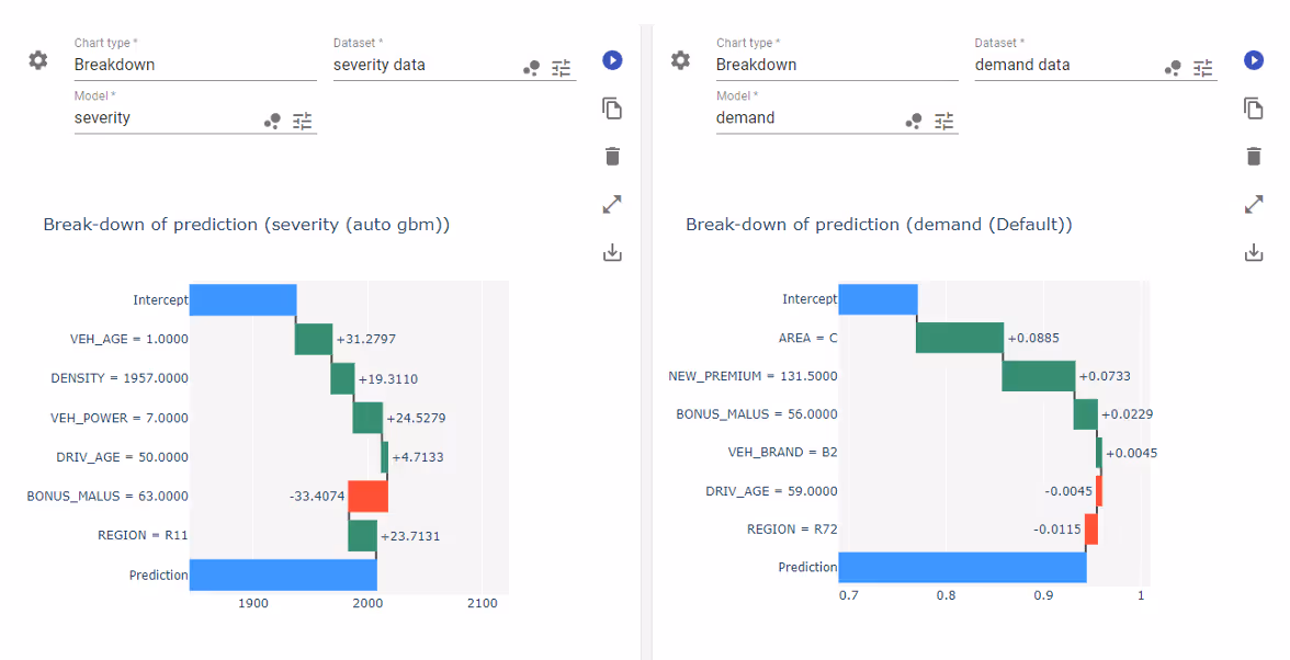
Breakdown or SHAP
There’s an idea of a local method which aims to quantify the impact of all variables on the model output around a single datapoint. It may have a different theoretical basis and can be implemented in different way. However, the core idea is clear: what if we could extract from a non-linear black box model sort of intercept value and then calculate how each variable contributes to adjustments?
The answer provide visualisations like breakDown or SHAP (Shapley Additive Explanations). These are model-agnostic methods, meaning they work well for all models regardless of their structure and architecture. Both rely on conditional responses of the model. In terms of methods and computations breakDown is easier to interpret and is calculated faster, while SHAP has properties proven on the ground of the game theory, but they are restricted to the class of additive feature attribution methods.
There are also other, simpler methods which aim for the same goal: Locally Interpretable Model-agnostic Explanations (LIME) or Local Interpretable Visual Explanations (LIVE). Those methods fit an auxiliary linear model in the neighbourhood of the analysed datapoint and the conclusions are drawn from their coefficients.
The methods I mentioned fall into local surrogate category. It means the method relies on building a smaller, simpler model in the neighbourhood of the chosen point. While breakDown and SHAP keep a non-linear structure, LIME and LIVE fit a linear model.
Anyway, those methods give us a glimpse into the simplified local dynamics of the model in greater complexity than previously described methods. Changes in risk profile, demand, and other values used in pricing can be better understood.
Variable Importance
Last method I want to mention falls into the global category and its purpose is to quantify the impact the input variables have on the model. There are several ways to do that – again which differ in implementation and results. Some methods can be dedicated to a more or less narrow class of models (e.g., tree-based importance score which is calculated during the training of the tree-based estimator) and other have no restrictions.
One of the ways it can be done is Permutation Importance. It is a very versatile method, because it is model agnostic – it does work with all estimators regardless of complexity. The fundamental idea here is to quantify how much (on average) will the prediction accuracy decrease if we scramble the data within a chosen column of the dataset. The drawback here is that it is computationally expensive.
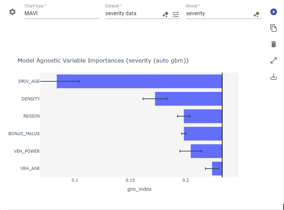
In general, the variable importance score allows us to better plan the explanation process. Indeed, when we see a list of input variables organised according to importance score and we need to understand why e.g., predicted claim frequency changed so much, the first place to turn our eyes should be the variables with highest impact. Whether it’s driver age, region code, or population density we have something better than a guess. This is especially useful when the model contains lots of variables (tens or hundreds).
Models
Sometimes a plot might not be enough. In situations like this it might be useful to locally approximate a complex black box model with a simpler one and not derive a metric from it but rather consider it whole. In case the auxiliary model is simpler but still complex remember we can still use visual methods from the previous section.
Rule-based models
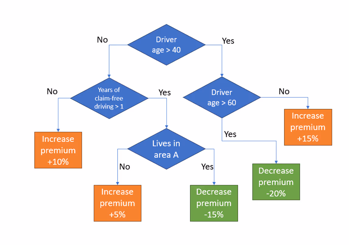
In the insurance pricing, the rule-based model is developed to explain the premiums calculated by the underlying pricing model, which might be a more complex and intricate black box model. The rule-based model acts as a surrogate by approximating the decision boundaries and logic of the original model with a set of explicit rules. The rules are derived from analysing the relationships between the input attributes and the premiums in the available dataset.
For example, we can fit a single decision tree in the vicinity of the data point for which we want to explain the premium. Since decision trees have very clear interpretability (if-then rules like “if the driver has installed an approved anti-theft device, then decrease the premium by 10%”) the explanation they provide is crystal-clear even for customers.
Other extensions
The rule-based methods can be extended in numerous ways, going beyond a simple decision tree. One can use rule lists, fuzzy rule-based systems, or include certainty factors which help to assess the confidence or reliability of the result. Each time we need to choose the one that fits better with our needs and models.
Global surrogates
Since I already mentioned the local surrogates, for the sake of completeness I should tell something about global surrogates, also known as proxy models). These methods try to approximate a complex black box model (can also be used with non-linear combination of linear models) with another one with clearer interpretability. The ‘global’ part refers to the assumption that the conclusions drawn from e.g., linear approximation will be valid for the non-linear complex model as well. It’s a holistic approach to model analysis.
The weak point of this class of methods is the fact that a lot of information and intricacy is lost in the approximation. These are not as frequently used as local methods. However, they might be required to comply with regulatory requirements, e.g., report the price structure which fits the general template.

Summary
This was a subjective overview of several popular ways to analyse how the black box model arrives at a prediction value. We covered plots and model-based methods classified as local or global. The realm of XAI (eXplainable AI) is a broad territory and as such includes lots of ways to approach clarification of the black box models. They differ with implementation details, so each has strengths and drawbacks that the others don’t.
The tools and insights they provide make our price models complete.
%25204x.avif)