How to make sure your risk model is the best possible

In the process of insurance pricing (see our previous post) one usually has to develop risk models. A risk model is a model that is used to predict quantifiable amounts of insurance risk. Most commonly used risk factors are claim frequency and claim severity. By calculating a product of the two models one gets the basis for insurance premium, i.e. the actuarial cost. The components may differ, they can be split further with respect to e.g. claim type (bodily injury, property damage, etc.) or claim size (attritional, large).
Sometimes we might need to develop an ensemble of models for the same task to average their outputs, because each single one can fit better to a different segment of data. Risk model development requires large amounts of data to train. For this reason, business lines with the highest volumes of policies (e.g. car, household, health), are best suited to develop price model this way. Life, specialty or low volume commercial insurance might be calculated in other ways.
The most important KPI in insurance is loss ratio. In a nutshell it is a ratio of claims paid with claim adjustment expenses to the premiums earned.
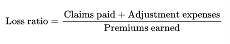
So in enumerator it contains the claims which materialise during a period, and in the denominator it contains a value based on the expected amount of claims paid (with expenses). If the premium is calculated accurately, the loss ratio remains stable. Otherwise, the expected claims amount is miscalculated, and if the insurance company has to pay more in claims, it results in higher loss ratio (higher enumerator and lower denominator) than expected. As a consequence, pricing actuaries put a lot of effort into creating accurate risk models and analyse them in detail.
So there arises a prevalent and very important question: how do I make sure that my model is not only good but also better than its previous versions? How to select the best model from the candidates we already have? To answer these questions numerous statistical measures and techniques have been developed. Here’s a quick and subjective overview of some of the most used methods.
Visual methods
After your model is successfully trained, begin visual validation on charts and plots – it’s the most powerful way of making sure the model predictions align with the data. It’s important because unlike with some statistical measures, it doesn’t require any version to compare. You just see how well or bad the model fits the data and where it might need further development.
Target vs. Predicted
A fundamental chart in this task is what we call Target vs. Predicted.
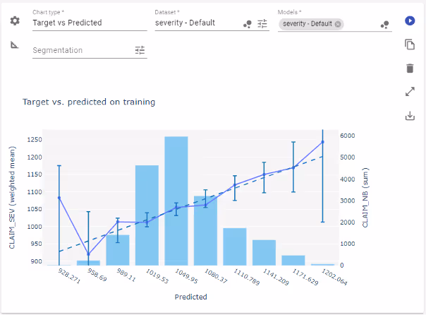
This chart shows how well the predictions align with the data. To create it, we plot the (weighted) average of the target variable values against the average model prediction. In the case of the perfect model, the chart should look like a straight, diagonal line (here the dotted one). In general, the plotted line should be close to the perfect case at least in most frequent cases. The frequency is displayed as the bar plot in the background.
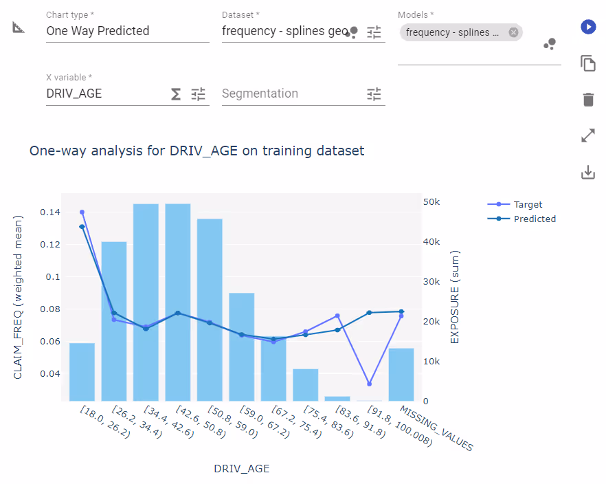
One Way
Next in line is the one way chart.
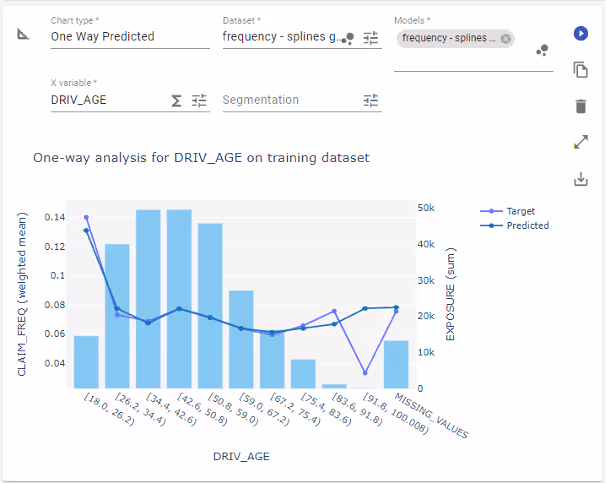
It shows two things: the average output of the model and average value of target variable plotted against a chosen feature. The bar chart in the background again indicates the frequency of observations. It allows us to see directly the alignment of the model with the data, but this time in closer details. We can see the shape of the dependence and decide what kind of data transformation would be the most helpful here – e.g. binning the DRIV_AGE (driver age) variable or applying splines on it. Where the line plots diverge, the model might require additional attention, unless the sample is not very significant – we don’t want to swing from underfit into overfit.
Geo chart
The third chart is a variation of the one way but uses regions on a map as the X variable. It shows a geographical distribution of aggregated predictions (in this case the frequency model) and corresponding target variable.
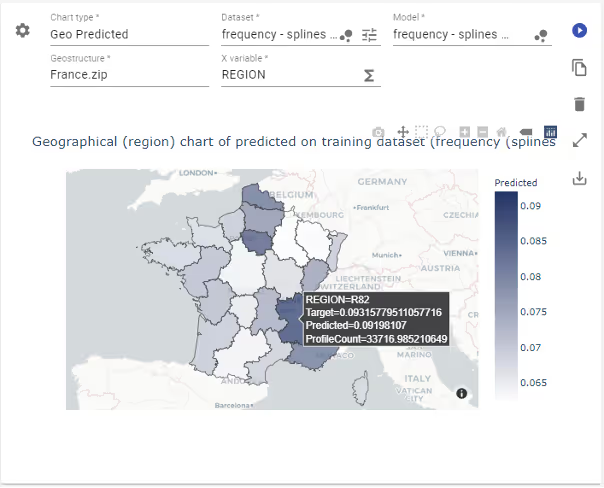
The advantage is obvious. It lets us see the patterns and outliers on the map. It is crucial to evaluate the model’s performance on a map, especially when the model uses geospatial coordinates.
Lorenz plot
As the last visualisation I want to mention the Lorenz plot.
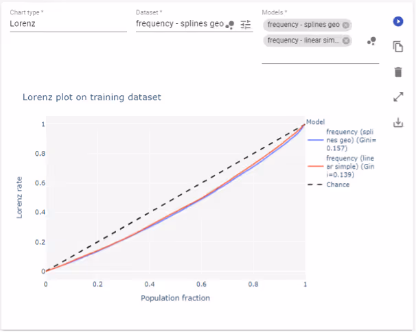
This one is particularly useful when we use the Gini index as one of the measures for our model. The Gini index is calculated based on the area between the central line and the Lorenz rate line. It aims to show how well the model captures variance in target variable and so how well discriminates profiles. The closer the plot line to the middle line – the more likely that the values are constant for all policyholders or have very low variance. The more it’s bent into the direction of the bottom right corner, the more structure the model captures, i.e. that there are some profiles with higher values and other with lower values.
The Lorenz rate is the percentage of aggregated true values corresponding to predictions not greater than a given prediction value level.
There is a caveat, like with the synthetic Gini score. This information cannot be used standalone. The Lorenz plot can only be meaningfully used to evaluate progress in modelling. Neither plot nor synthetic score give actionable information on the model. However, if we use it to compare at least two models of the same target variable, the one with the plot line further away from the middle line will be a better choice.
Measures
There is also a wide array of different statistics and metrics which aim to summarise model performance as a whole. Contrary to plots, this information is a synthetic, zero-dimensional, precise number. As such it needs to be used carefully, because it reduces the full complexity of the model fit to a single number. Anyway, these measures are commonly used by actuarial data scientists. Let’s take a look at some of them.
Gini score
Let’s start from the bottom of this list and discuss the Gini score. It has already been mentioned with the Lorenz plot. In data science Gini score is not the same as the Gini index from economics; however, the first is somewhat based on the idea of the latter.
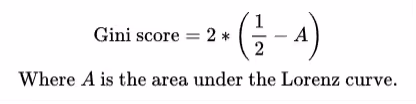
The score synthesises the information contained in the Lorenz plot and as such it tells us how well the model distinguishes target values between profiles. Again, the single value of the Gini score does not provide us with complete information on the fit of the model. We need to aim for values closer to 1, but 1 is not the ideal state (it means there’s only one profile that takes all values). What is the ideal value of the score is unknown and depends on the model itself. So rather than settling for a point value of the score, we should compare the scores between variants of the same model. The higher value of the Gini index is considered to indicate a better model.
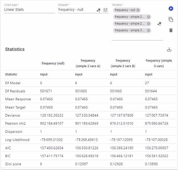
AIC and BIC
They stand for Akaike Information Criterion and Bayesian Information Criterion respectively. They are prediction error estimators, and similarly to the Gini score, should be used for model selection. Both are derived in terms of the likelihood function and number of model parameters. As such, these are very similar and so we will discuss them jointly.
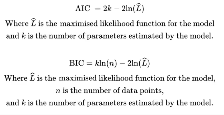
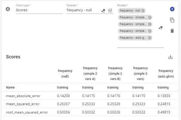
What AIC/BIC aims to quantify is the amount of information lost by representing a process by the model, so the higher the value, the more information we lose and so the model is of lower quality. By definition, they are sample size dependent and contain penalty term on the number of model parameters, so larger sample yields higher value and more model parameters also result in higher values.
This leads us to how to use these criterions correctly. Let’s assume we have two variants of the same model, say of claim frequency. Both have to be trained on the same dataset, of course. Then the model with a lower value of AIC/BIC is considered to be more robust and should be selected as the better one. Look at the table above. From the 4 models available all of them were trained on the same dataset, AIC points to the last one (“simple 3 vars” with 3 variables) as the best and BIC points to the third (“simple 2 vars B” - a variant of two variable model). The second and the third models have the same number of model parameters so comparing them with AIC/BIC is equivalent to using only the log-likelihood.
Log-likelihood
This statistic is closely related to AIC/BIC, as it serves as a base for their calculation. Here it does not contain any penalty term, so can be used more broadly. However, we must keep the same dataset, as the value depends on the sample size.
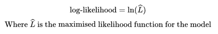
When using this measure, we look for higher values in the sense of simple real number comparison. It allows us to perform e.g. likelihood-ratio test of goodness of fit. However, there is a restriction on the models form – they must be nested, meaning the less complex model should be the more complex model with constraints.
Dispersion
In GLM/GAM framework in some distributions there is sometimes a need to adjust the variance with additional dispersion parameter. Usually, it should be equal to 1 (like in examples above), but with some distributions it happens that the variance of the model does not match the variance in the data. That’s when the dispersion parameter plays its role – to adjust the model to better fit the data. The information the parameter provides is roughly the scale at which the variance was mismatched.
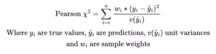
Pearson chi2
It is the value of the test statistic used in the goodness of fit test based on the Pearson’s chi-squared distribution. Its value should be compared to critical values for appropriate number of degrees of freedom.
Deviance
In the process of model fitting the predictions are evaluated against the data with appropriate unit deviance function. For each distribution family there is a natural choice of the unit deviance function.
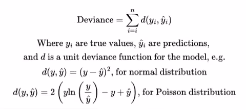
The measure we see on the chart however is the total amount of the unit deviances for the whole dataset. It tells us in aggregate how far is the model prediction from the true values in the data. So, like with AIC/BIC the measure depends on the sample size and can be meaningfully used only to compare models fitted with the same distribution family and trained on the same dataset. The number alone tells us nothing but can be used to select a better fitted model.
The statistics above were all dedicated for linear models and as such they are always available in the linear model design of the Quantee platform. However, for models in general (also non-linear and machine learning) there are also other measures. Most commonly used ones include MAE (Mean Absolute Error), MSE (Mean Squared Error) and RMSE (Root Mean Squared Error).
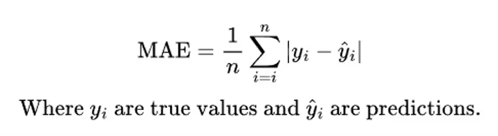
Mean absolute error
This measure calculates the average of the absolute value of the difference between target and prediction values. So, it tells us, how much on average does the model diverge from the data it estimates. Of course, it’s non-negative and MAE equal to zero means that the model perfectly predicts the data. On the other hand, high values might indicate that the model poorly fits the data.
Again, what is considered a good level of MAE depends on the task. Like in the table above – if we estimate claim frequency per policy (expecting a small, positive number usually below 1) and we train the model on data containing claim counts (exposure adjusted), then in most cases we have 0 in the data and in some cases we have values larger than 1. It’s impossible to arrive at a very low MAE values when on most data points the absolute difference basically equals to the prediction value.
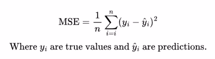
Mean squared error
Here the story is similar to MAE, but instead of the absolute value of the difference, we average squares of the differences. What does it change? It penalises high deviations more than the low ones. So, when the model diverges more from the data, it should be reflected in higher increase in the MSE value.
In the example above we see that MSE is higher than MAE, so the differences on positive values of the claim count are more visible with this metric.
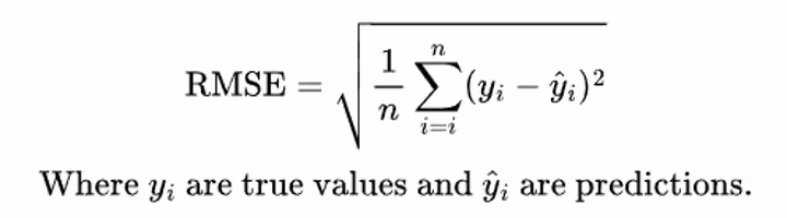
Root mean squared error
It is closely related to MSE – in fact, it’s just a square root of the MSE score. The purpose is to bring its values to their original range. Now the number can be easily related to the prediction, which in case of MSE was not really sensible.
Now what?
We’ve just learned something on risk modelling in terms of insurance pricing. We know what does risk model actually mean, how it relates to insurance premiums and why we need to make sure that the models we use are accurate – the quality of the risk model is directly reflected in the difference between the company’s actual loss ratio and it’s expected value. That’s why we use an array of statistics and plots to investigate model quality and select for the better one. Some of the methods discussed above are general enough to use with any kind of model (both linear or non-linear), the others were dedicated only to linear models.
However, we didn’t discuss any methods developed especially for explaining machine learning models. We might be already familiar with some of those, like the ceteris paribus plot (also known as single profile) or partial dependency (also known as average response). We’ll be covering this topic more broadly later.

So now we’re better equipped to develop the best possible risk model. If you are interested in software thanks to which you will be able to not only calculate, but also evaluate, validate and visualise your models - do not hesitate, contact us!